On-boarding System
Diligent on boarding application was built anticipating uploads in excess of 30,000 users at a time. Integrated with not only hosted batch upload ability but with active directory upload task completion. The challenge with this project were the iterations up to our beta. Successfully and strategically integrating one new feature or feature enhancement at a time.
A lean agile approach to the design process
Wires/Prototyping
I would start to build comprehensive experience wires of screens and component behavior that would more times than not reveal new features from an user experience perspective not thought of in the initial requirements.
A discussion with BA or PO to include in upcoming sprint or plan for another. Click through prototypes are also produced. Levels of interactive sophistication were based on time and importants.
Comps/Layouts
Once the wires were approved I would start the UI process in earnest even though I may have started already in the wire stage. With short sprint cycles any edge you can get the the previous stage helps. I start to apply brand and finishing style via comps.
Time will determine if I work out click through prototypes or something more interactive via, inVision, Sketch or Axure. On this project Illustrator click through PDF’s where the standard and worked well!

Wires don’t have to be ugly…
Refining the big picture business requirements
Once the business requirements are initiated from product owners and BA’s. UX is brought in to consume the high level requirements and add user experience best practices and research to the requirements as needed. The practice helps solidify the concept for both business and development, from the written word to a high level visual representation of the applications eco system so to speak.
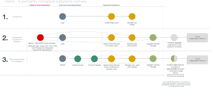
Refining the chosen happy path and what feature first!
Once everyone is on the same page another level of granularity is established. For example you may mention in the first iteration “choose a license” in this phase you may break down the different licenses a user can consume – and what happens after that. So in the end there is an entire flow on user license consumption, and what happens after that at still a fairly high level. This phase may also discover features that may be added to the project scope.

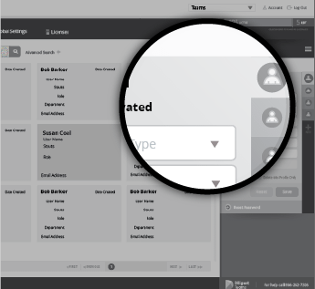
Wire-framing and prototyping
I used a combination of white boarding, illustrator and acrobat to create comprehensive UX click through wires/comps. Depending on time the wires will establish where things live in the layout as well as a certain amount of style. In an agile environment there really is not enough time to establish clear wires vs clear comps. It’s something in the middle thus UX/UI practice. However, enough for business and development to understand what we are building. it’s an iterative process the final release may not be the ultimate release but a working version of the application.
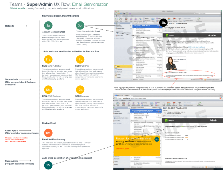
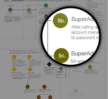
Sorting out complex experience flows
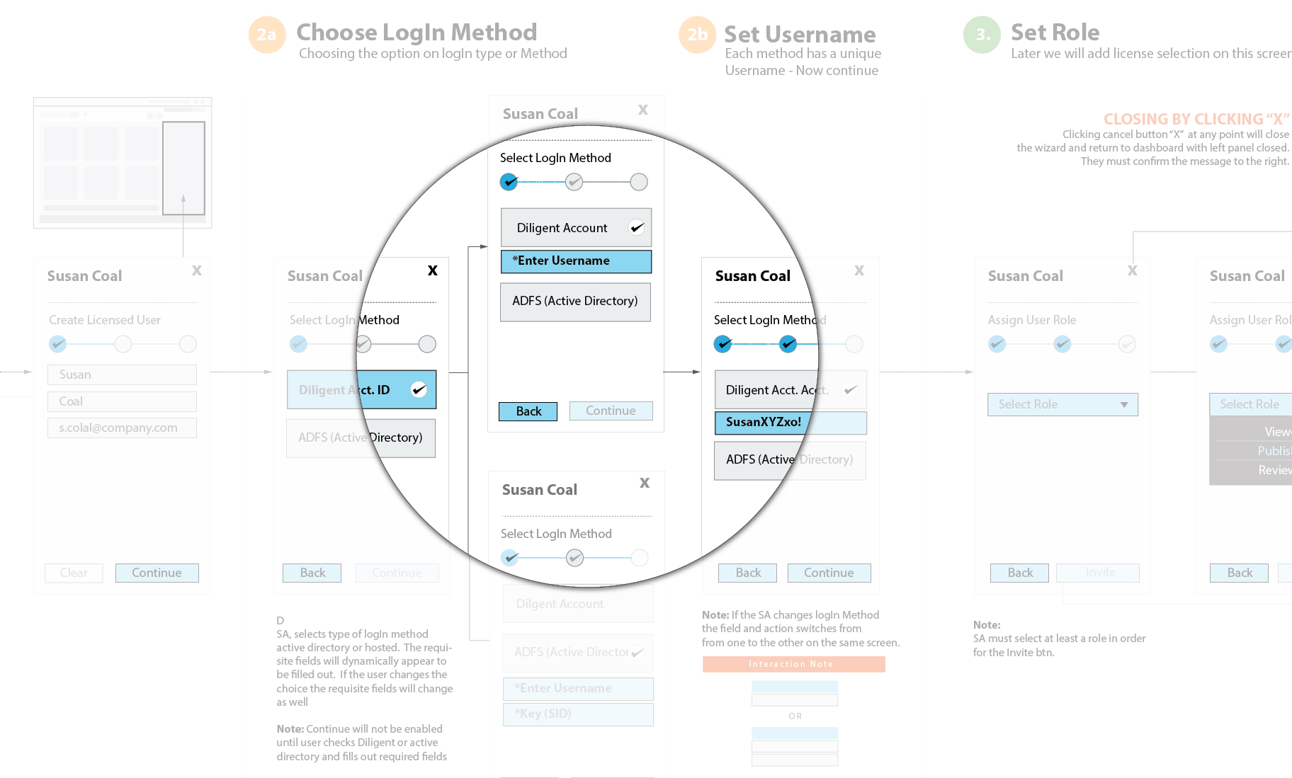
Here we were refining a application feature integration that worked to integrate active directory users from outside client companies. After spending days deciphering our application engineers theoretical way on achieving the feature – I had to make it make sense to business and development as well as QA so they knew how to test it. It was a real challenge and well received. A funny story with these flows – we had an important meeting in which the architects were explaining to business how ADFS would be integrated and work with our platform. After an hour the ADFS Single Wizard Flow was shown to business and they finally said oh! Now we get it! Flows are critical in communicating complex feature integration, for those that don’t have PHD’s in application design.
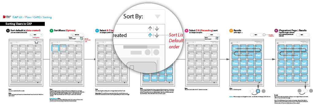
Interaction flows
Sometimes depending on what frameworks your team is working on – how something works is yet another level of granularity designing. Shown below is a part of how we where establishing sorting switching from data line item rows to cards. Questions and research were around pagination or infinite scroll. Multi-select was now also on the table. If users are sorting they are
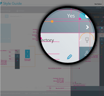
UI, typography, and iconography
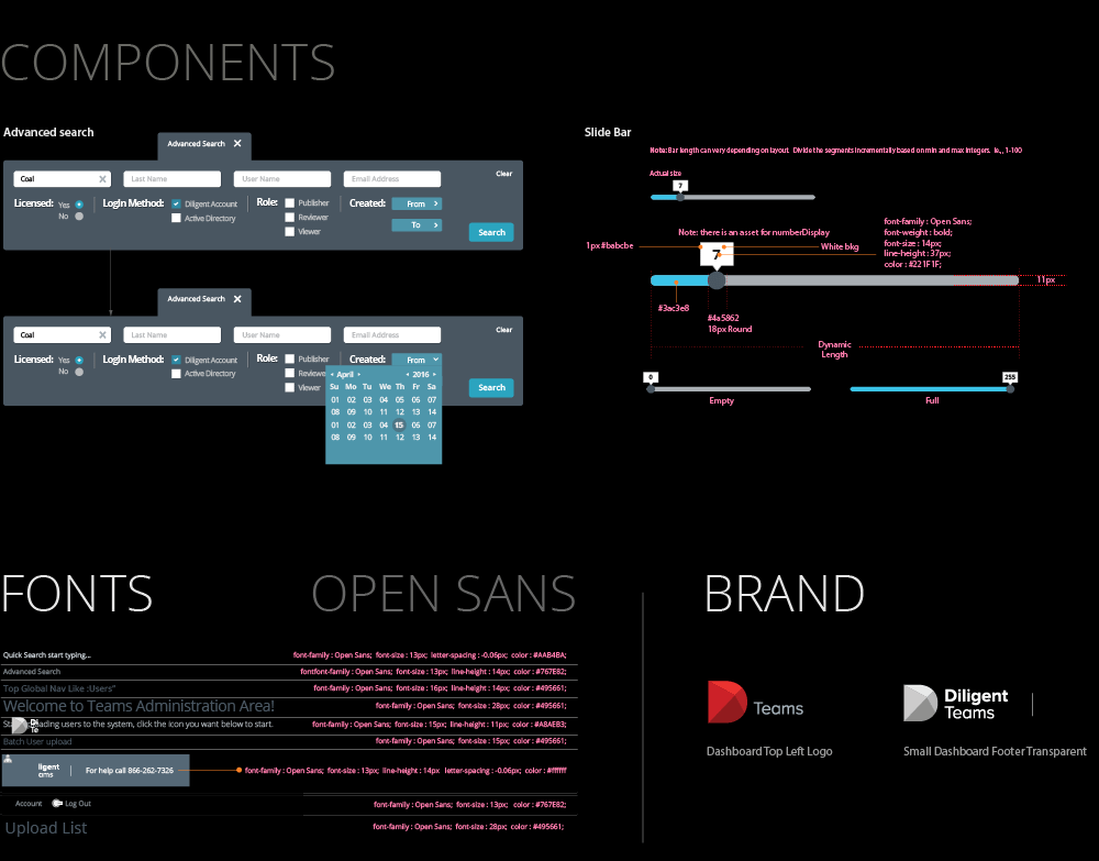
I like to work on the layout before it gets to the comp stage. In an agile fast past production cycle you should be about 80% solid on the layout in general. This is more or less the time to start tightening the composition and creating or adhering to corporate brand standards.
It’s an iterative journey…
Intuitive User Interface
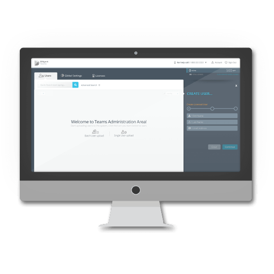
Diligent’s client admin portal is in it’s 3rd product release and continues to grow with features and user friendly tools to successfully manage 1000’s of users at a time and individually. From licensing provision and consumption, granular permissions settings, client branding, hosting and active directory integration! A powerful on-boarding tool, I was very proud to work on.

Dual-edged management
The client admin portal featured above, has a mini me! In tandem we worked on a client provisioning portal that actually on-boarded the client company! This portal set up groups of pre set permissions based on the clients licensing package and how many users they anticipated. Company like Master Card, Chase Manhattan and Disney to name a few.

